Overview
An automotive interface to ensure drivers find parking spots easier, faster, and more efficiently.
My Role
UX Research, UX Design, Visual Design
Duration
July – November, 2022
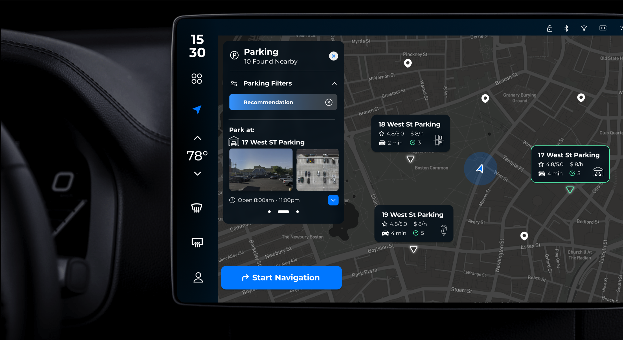
An automotive interface to ensure drivers find parking spots easier, faster, and more efficiently.
UX Research, UX Design, Visual Design
July – November, 2022
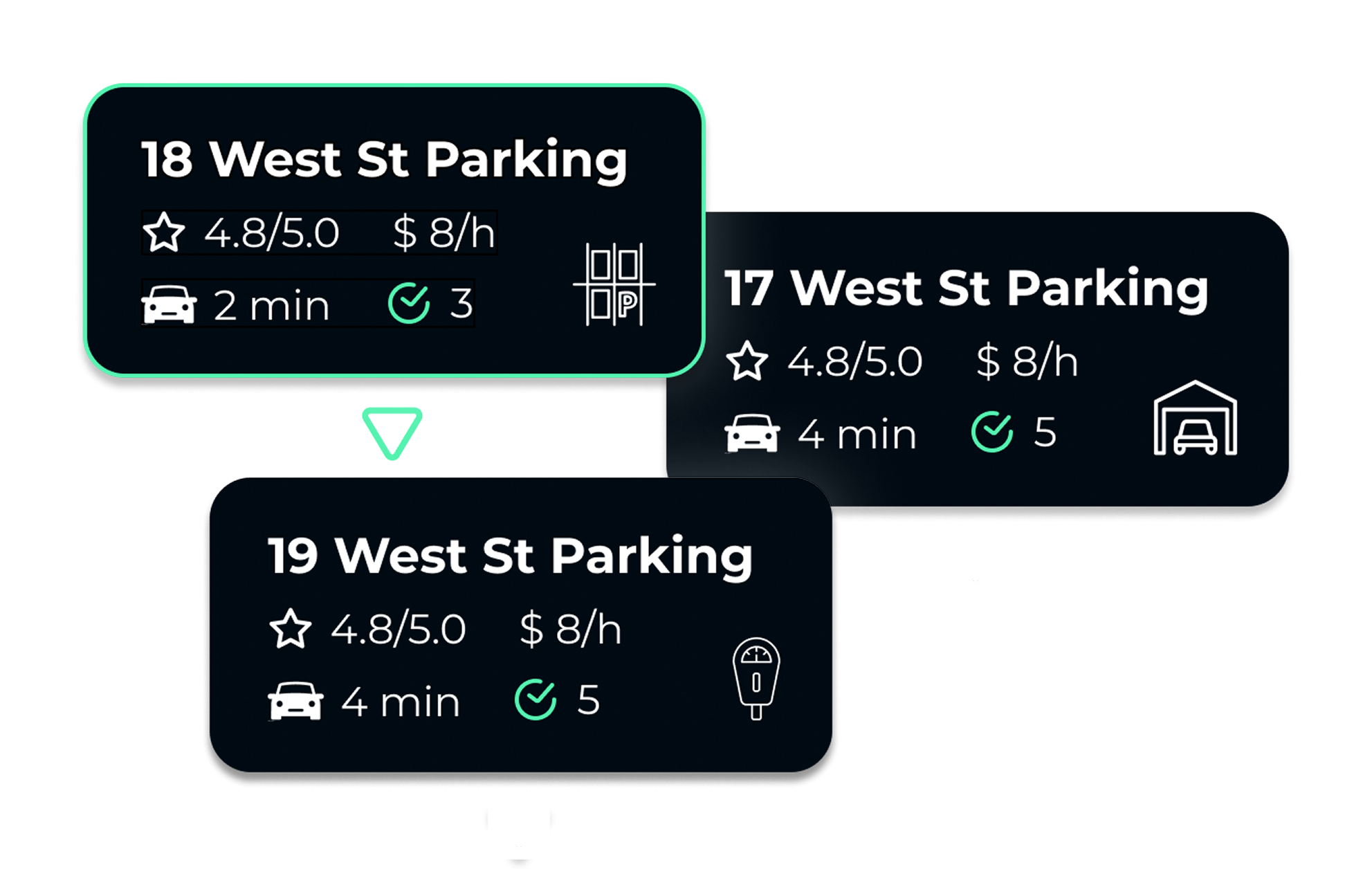
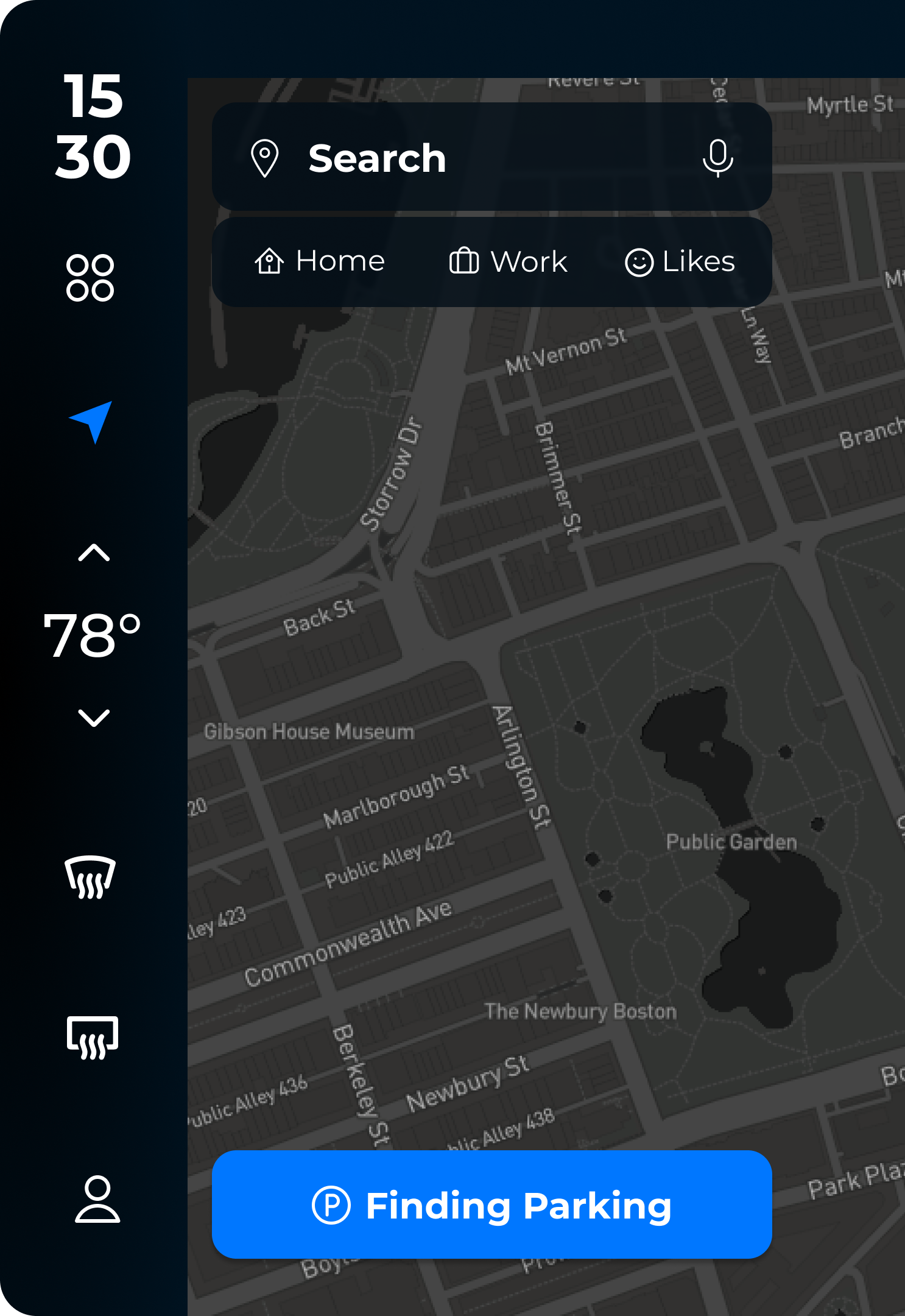
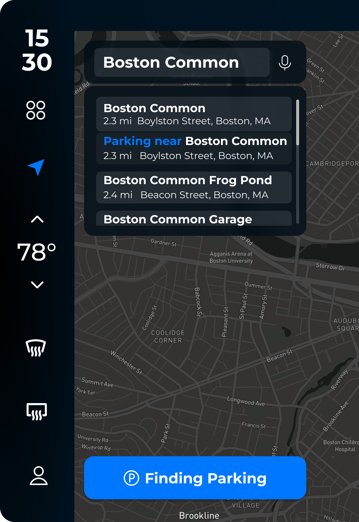
This feature helps users find nearby parking based on their real-time location, preferences, and the logistics of each parking option.
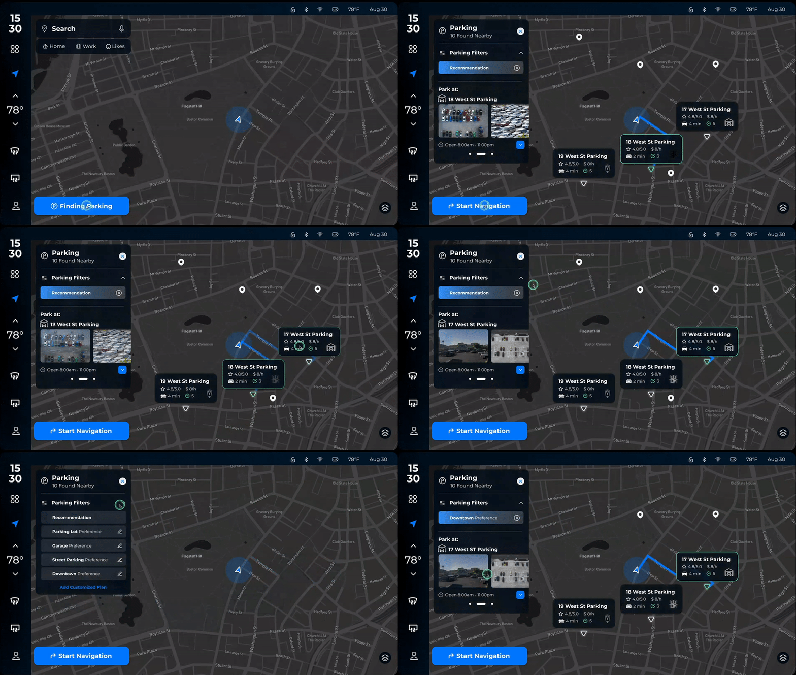
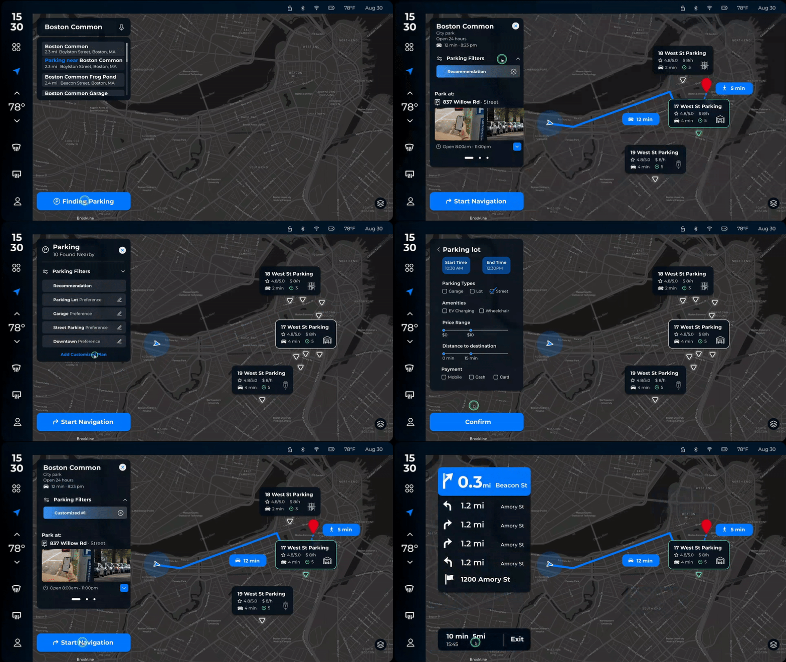
Prior to the trip, users can find parking space near the destination. The application can filter out the options that do not match their preferences.
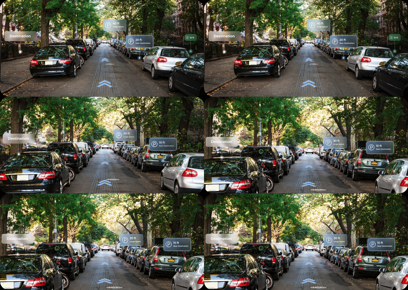
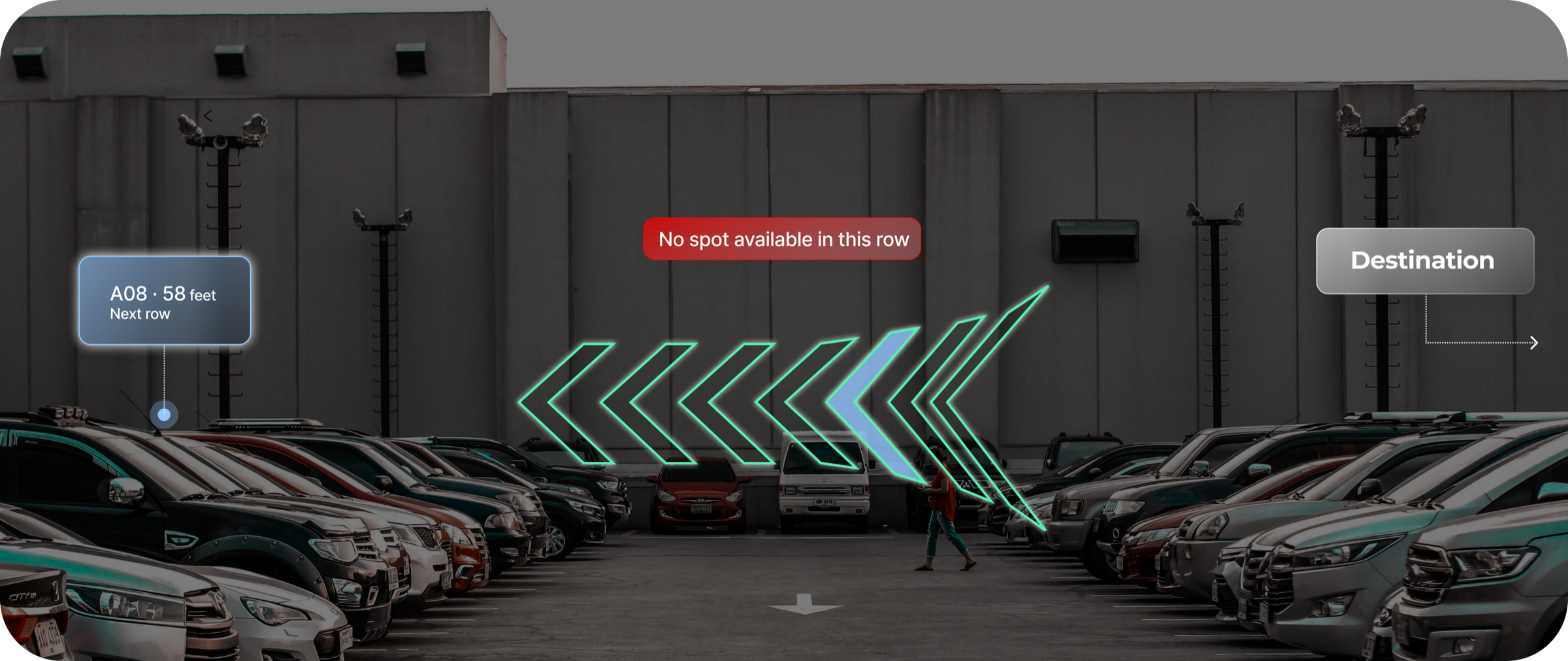
Both the HMI screen and heads-up display show details about street parking, including exact available spots, distance, destination, price, the location of meters, and more.
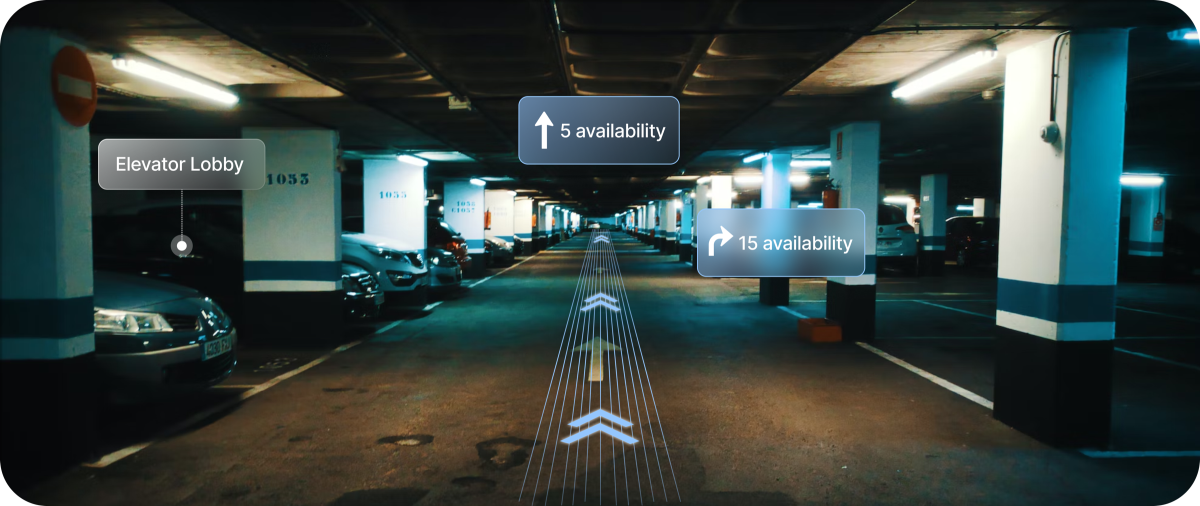
The heads-up display shows details inside the structure, including available spots' directions, distance, destination, price, the location of the destination, and more.
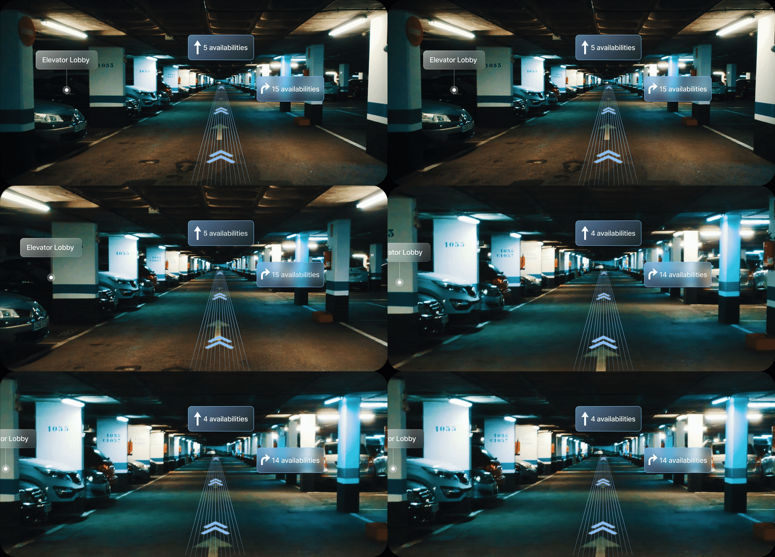
Both the HMI screen and heads-up display provide drivers information about parking space availability and parking assistance.
Cars are an integral part of many people's lives, providing freedom and mobility. In fact, 91.6% of American households own at least one car. However, the popularity of personal vehicles can lead to difficulties in finding parking spots, which can result in wasted time and increased anxiety.
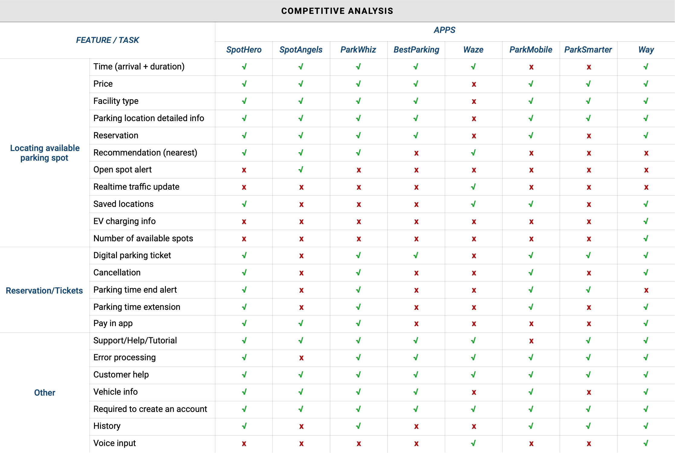
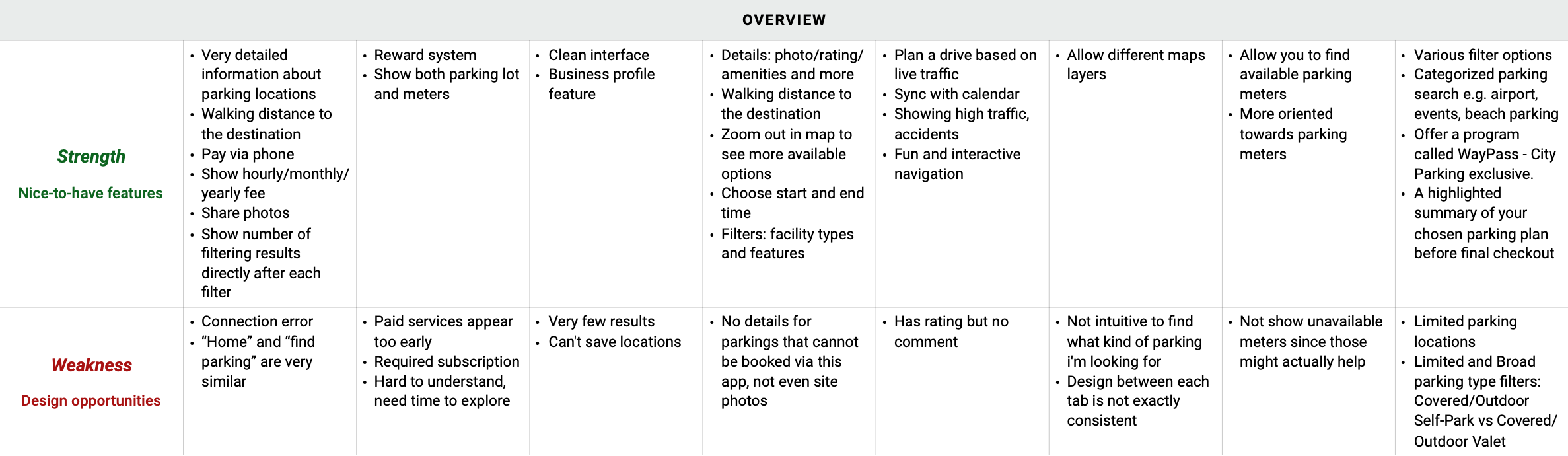
I conducted a competitive analysis of current parking apps, along with interviews to understand users' personal experiences with parking and their needs.
None of the platforms we researched provides detailed information about exact parking spots — only metered parking can be located. Yet interviewees reflected that finding an available spot could take a very long time.
Every driver has their own preferences for parking — where to park, the rate, whether it has certain amenities, and more.
Almost no platform provides information about street sweeping times, payment options, parking durations, and more. Users would love an efficient way to access parking-policy details, especially first-time visitors.
We developed a journey map, recording specific actions across the different phases of drivers' parking journey and listing out the pain points and opportunities we could address in our design.
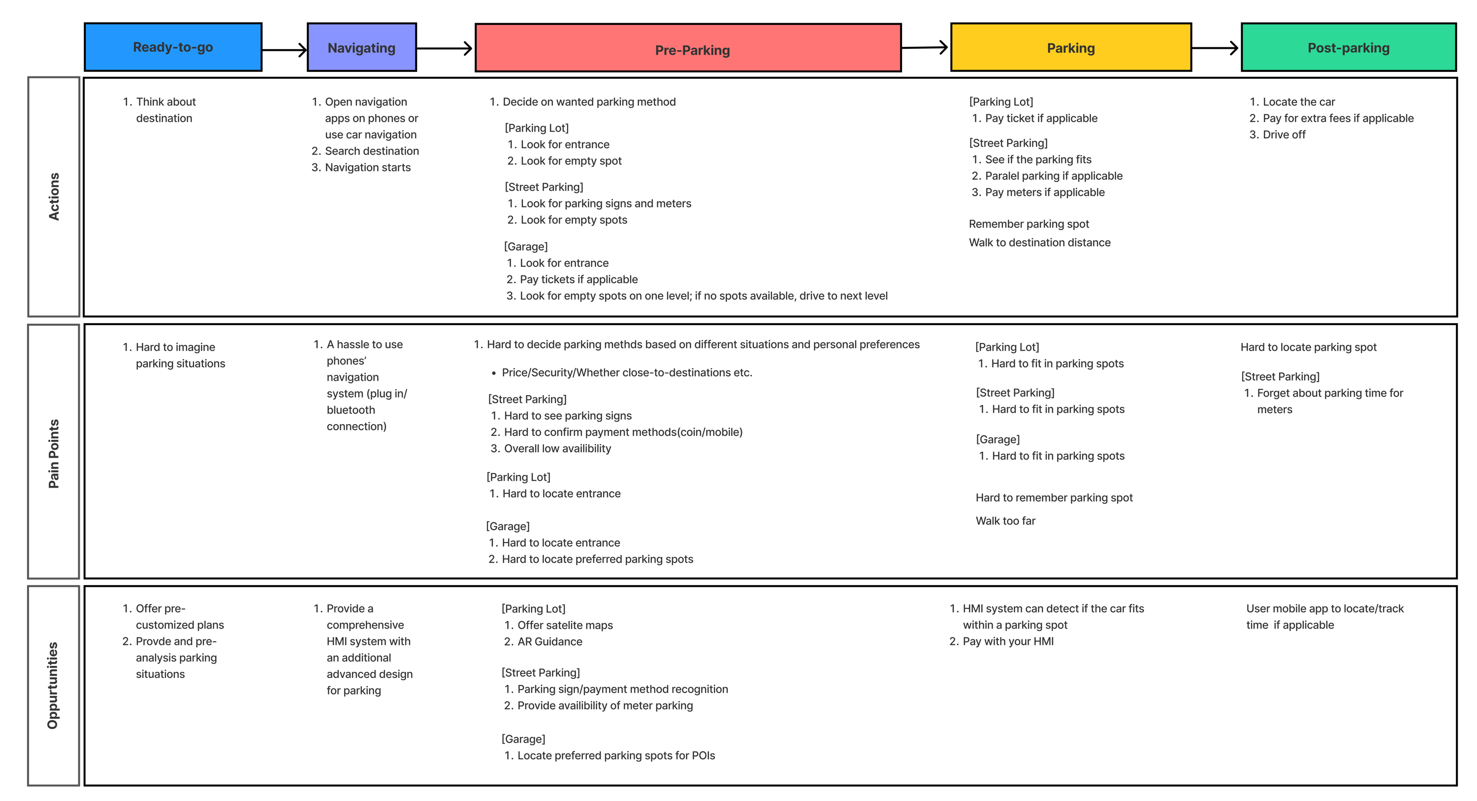
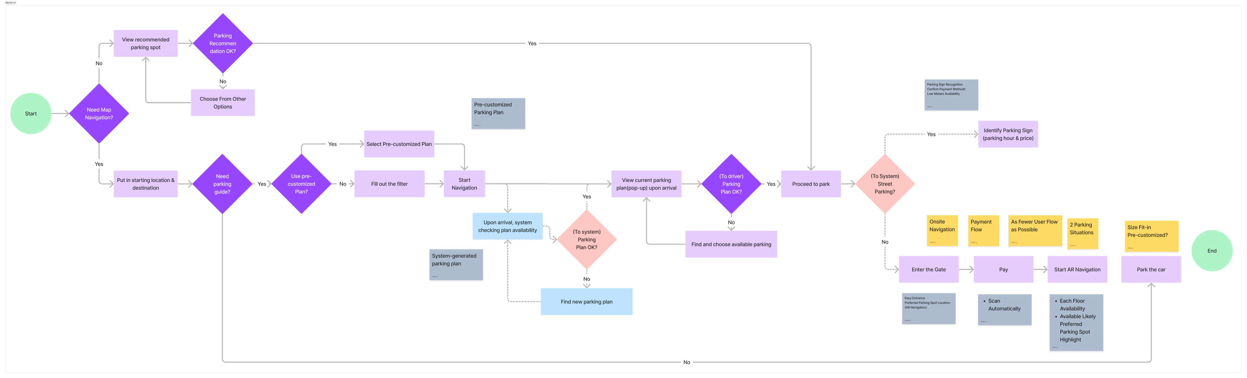
Infusing the brainstormed potential solutions into the user journey, we developed a more holistic view of the application in detailed steps, and re-evaluated the features and functions to see if they addressed the pain points we discovered above.
After consolidating the idea, I turned the wireframes into high-fidelity prototypes for user testing.
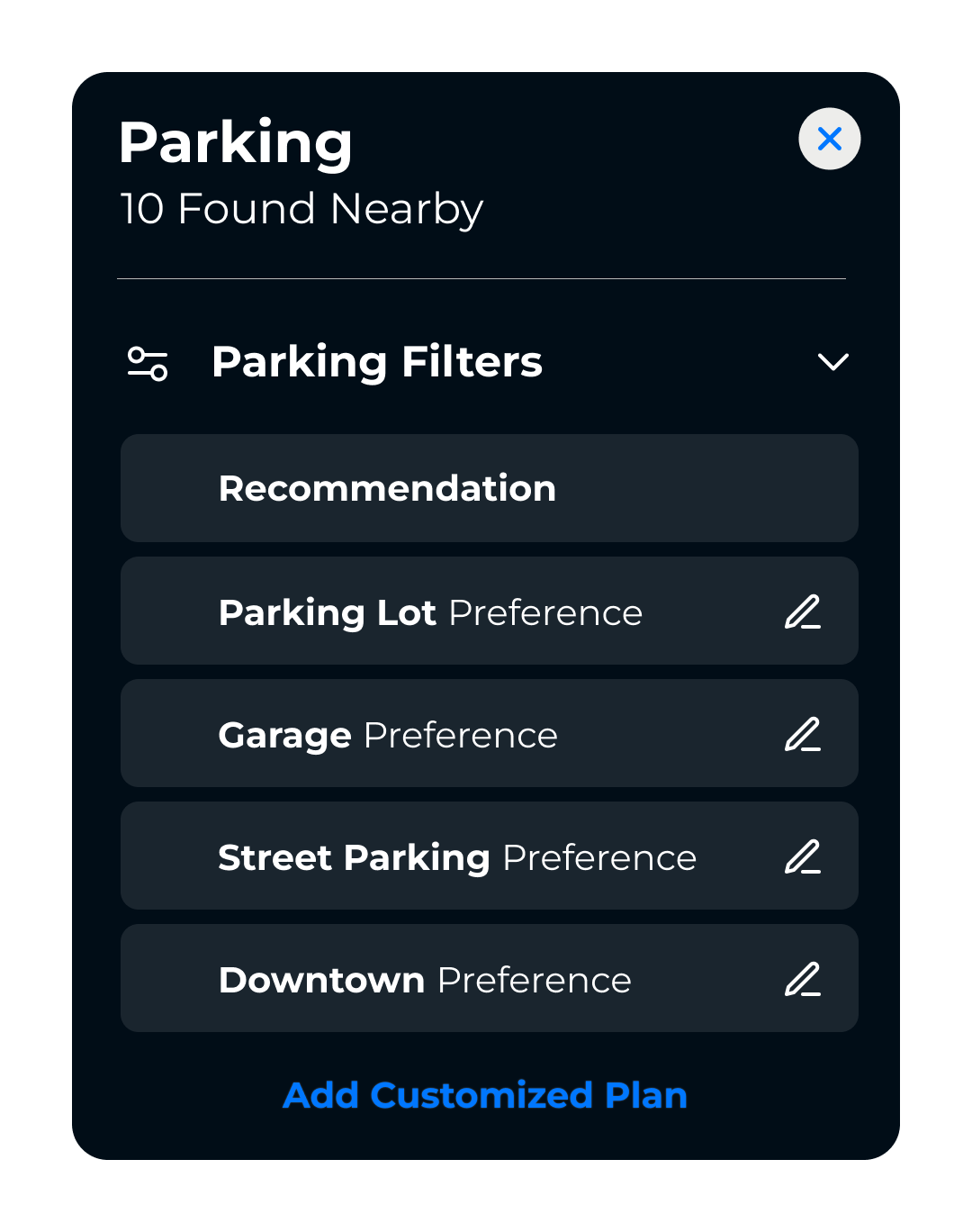
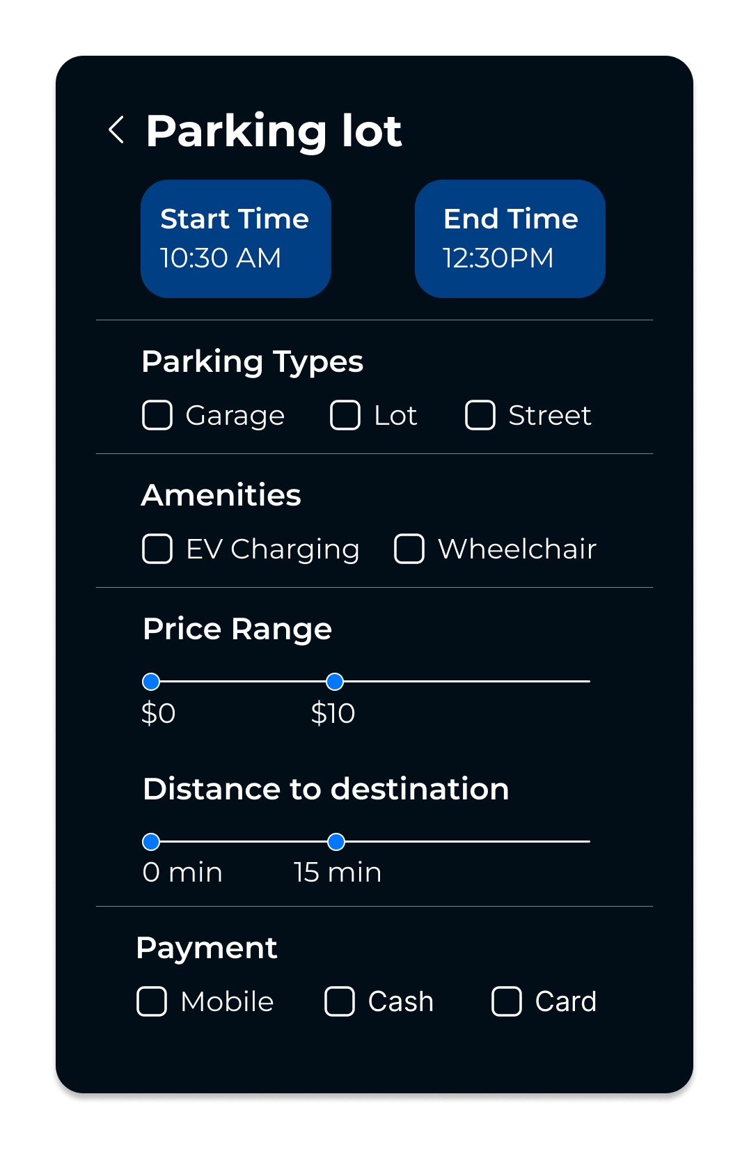
After finishing the high-fidelity mockups and prototyping, I conducted four user testing sessions to examine effectiveness and usability — the goal being to see whether our designs solved users' needs.
Users appreciated the dual parking-view options, but 90% found them confusing and less useful.
Users noted the small, less accessible Start Navigation button in the parking options, affecting usability and readability.
Parking info on the heads-up display and AR is useful, but users complained about information overload and color confusion.
Users suggested enhancing the HMI screen to display parking information upon arrival, requesting additional details. For street parking, they'd like available spots and the destination marked on the map, in addition to the current rate and time period.